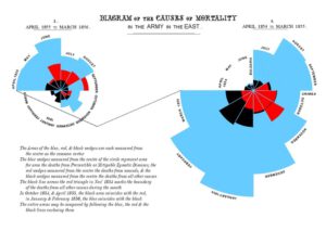
Florence Nightingale is credited with developing the polar area diagram, also known as the "coxcomb chart" or "rose diagram."
She created it around 1858 to visualise mortality data from the Crimean War. The chart used coloured wedges of varying sizes to show the causes of soldier deaths month by month. It made strikingly clear that the vast majority of deaths were caused by preventable diseases (such as cholera, typhus, and dysentery) rather than battle wounds or other causes.
The genius of the diagram was its visual impact — it communicated complex statistical data in a way that politicians and military officials who weren't statistically minded could immediately grasp. It was a powerful advocacy tool that helped Nightingale argue successfully for sanitary reforms in military hospitals.
While she didn't invent statistical graphics from scratch — earlier pioneers like William Playfair had developed bar charts and pie charts — her polar area diagram was an original and innovative contribution to data visualisation. She's often recognised as one of the first people to use statistical graphics as a persuasive tool for social and political change.